Information Diffusion models are used to simulate how information spreads through a network from a set of seed nodes, considering the influence probability between nodes.
To plot the spread of information using the Independent Cascade Model in a NetworkX graph and visualize it using Plotly, you can follow these steps. Here’s a step-by-step guide to create a function that simulates the Independent Cascade Model and visualizes the activation of nodes over time.
Step 1: Set Up the Network and Calculate Centrality
First, set up your NetworkX graph and calculate the centrality measures if needed.
Step 2: Simulate the Independent Cascade Model
Simulate the Independent Cascade Model to determine which nodes get activated over time.
Step 3: Visualize the Activation Process
Use Plotly to visualize the activation process of the nodes.
Here is a complete example of how you can achieve this:
import networkx as nx
import plotly.graph_objects as go
import numpy as np

def independent_cascade(G, seed_nodes, influence_probability, max_steps):
    # Initialize the set of active nodes
    active_nodes = set(seed_nodes)
    # Initialize the set of newly activated nodes
    new_active_nodes = set(seed_nodes)
    # Store the activation history
    activation_history = {node: 0 for node in G.nodes()}
    for node in seed_nodes:
        activation_history[node] = 0

    step = 1
    while new_active_nodes and step <= max_steps:
        # Update the set of newly activated nodes
        new_active_nodes = set()
        for node in active_nodes:
            for neighbor in G.neighbors(node):
                if neighbor not in active_nodes and np.random.rand() < influence_probability:
                    new_active_nodes.add(neighbor)
                    activation_history[neighbor] = step
        active_nodes.update(new_active_nodes)
        step += 1

    return activation_history

def plot_independent_cascade(G, activation_history):
    # Get node positions
    pos = nx.spring_layout(G)

    # Extract node coordinates
    node_x = []
    node_y = []
    for node in G.nodes():
        x, y = pos[node]
        node_x.append(x)
        node_y.append(y)

    # Extract edge coordinates
    edge_x = []
    edge_y = []
    for edge in G.edges():
        source, target = edge
        x0, y0 = pos[source]
        x1, y1 = pos[target]
        edge_x.append(x0)
        edge_x.append(x1)
        edge_x.append(None)
        edge_y.append(y0)
        edge_y.append(y1)
        edge_y.append(None)

    # Create edge trace
    edge_trace = go.Scatter(
        x=edge_x,
        y=edge_y,
        line=dict(width=0.5, color='#888'),
        hoverinfo='none',
        mode='lines'
    )

    # Create node traces for different activation steps
    node_traces = []
    max_step = max(activation_history.values())
    for step in range(max_step + 1):
        node_step_x = []
        node_step_y = []
        for node, activation_step in activation_history.items():
            if activation_step == step:
                x, y = pos[node]
                node_step_x.append(x)
                node_step_y.append(y)
        if node_step_x:
            node_trace = go.Scatter(
                x=node_step_x,
                y=node_step_y,
                mode='markers',
                hoverinfo='text',
                hovertext=[f"Node {node}: Activated at Step {step}" for node in G.nodes() if activation_history[node] == step],
                marker=dict(
                    size=10,
                    color='blue' if step == 0 else 'red',
                    opacity=0.7
                ),
                name=f"Activated at Step {step}"
            )
            node_traces.append(node_trace)

    # Create the Plotly figure
    fig = go.Figure(data=[edge_trace] + node_traces)
    fig.update_layout(
        title='Independent Cascade Model Simulation',
        showlegend=True,
        hovermode='x',
        margin=dict(b=20, l=5, r=5, t=40),
        xaxis=dict(showgrid=False, zeroline=False, showticklabels=False),
        yaxis=dict(showgrid=False, zeroline=False, showticklabels=False)
    )
    fig.show()

# Example usage
G = nx.DiGraph(nx.path_graph(5))
seed_nodes = [3] # start point
influence_probability = 0.5
max_steps = 5

activation_history = independent_cascade(G, seed_nodes, influence_probability, max_steps)
plot_independent_cascade(G, activation_history)
Explanation
- Independent Cascade Model Simulation:
- The
independent_cascadefunction simulates the spread of information from a set of seed nodes based on the influence probability. - It returns a dictionary where each node is mapped to the step at which it was activated.
- Visualization:
- The
plot_independent_cascadefunction uses Plotly to visualize the activation process. - It creates separate traces for nodes activated at different steps, coloring them differently to distinguish between early and late activations.
- The layout is updated to show the legend and other visual settings.
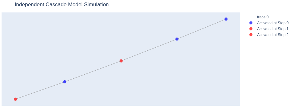
This approach allows you to visualize the spread of information through the network over time, highlighting which nodes were activated at each step of the simulation.
With a more practical dataset of actual web urls we can have our plot as below
G2 = nx.from_pandas_edgelist(df,source="source",target="target")
seed_nodes = ["https://blog.jcharistech.com"]
activation_history = independent_cascade(G2, seed_nodes, influence_probability, max_steps)
plot_independent_cascade(G2, activation_history)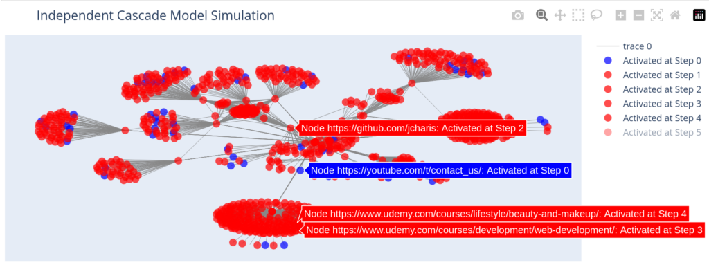
Thanks for your attention
Jesus Saves
By Jesse E.Agbe (JCharis)